Scrapbook Design, free tips and design ideas to use with Glitter Stacks
I have been looking at this Glitter stack
since last year and actually found the use of the these designs pages hard to relate to with my photos, so today I decided to stop procrastinating and find a way to use the pages to best effect.
Spots large or small, a too busy background?
Spots large or small, I find particularly disconcerting as they draw the eye away from the subject matter, when you actually want your photo’s to be the centre of attention, not the background paper. This stack has quite a few pages with different types of colored spots. I’m pleased I shared this stack with a friend.
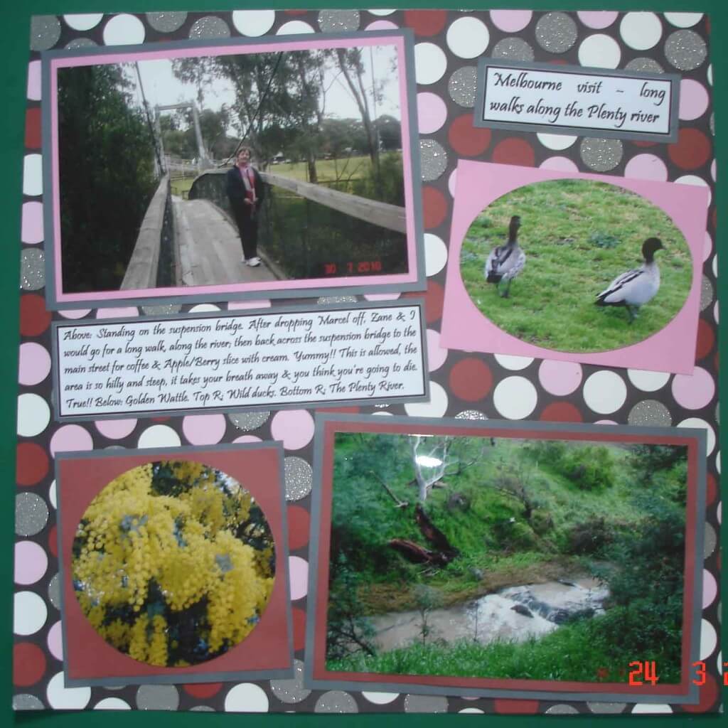
The photo’s are from my visit to Melbourne last year to a suburb called Greensborough. The river Plenty runs through Greensborough. The river for the most part is nothing more than a running creek, however it is a pleasant place to visit for walks, and a popular habitat for parrots, rosellas, lorikeets, ducks and other native birds.
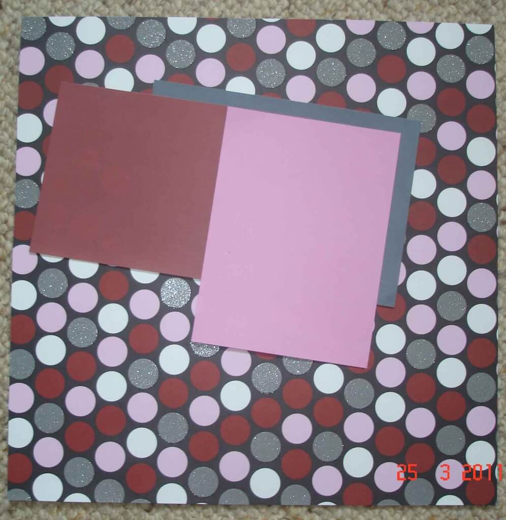
As a challenge I decided I would use the big spots with the glitz. The glitter was the attraction of this stack to begin with, when I first saw it on Amazon. This particular sheet from the stack has a black background with large spots in pink, russet, white and gray with glitz, so I looked for these colors in each photo. It is a very strong background to work on.
Photo selection and matting
I finally selected four photos for the page relating to my topic, which I thought I could co-ordinate with matting using sheets from the Bazzill Basics Paper.
I chose colors in the same toning as the background paper. The background paper in this instance was so strong, I felt adding another color again would be just too much! This way I think the completed page is more subtle in both color and design.
Scrapbook Design strategy
Looking at the top photo on the left in the completed page, you will see it has a lot of grey in the bridge and sky. I’m also wearing a scarf with a touch of pink in it. These colors all relate to the background page. In the first instance I tried this photo against the russet color, I thought the photo was a bit lost as the background page is so strong. I decided to try the grey behind the russet to define the photo more, but thought it too dark. Then I decided to try the pink (as in my scarf). I thought the pink highlighted this photograph, and the grey mat behind the pink mat, defined the photo against this busy background page.
Wild Native Ducks
The photo of the ducks contained grey and white with a lot of green. I opted to crop this photo in an oval shape, and used the pink mat to tie it in with the first picture. Since there was nothing else in the photo apart from the ducks and green grass, cropping defined the subject.
Golden Wattle
The third picture has the wattle which is yellow with grey-green leaves. I tried each background color I had selected as a mat behind it, and felt that the russet color made the wattle stand out the best. I cropped this photo in a circle and framed it with the russet mat directly behind, and then the grey mat which helped define the photo against the background page.
The Plenty River
In the final photo of the Plenty river, I picked up the russet color of the burnt-out tree on the riverbank as well the grey tree trunk, and the greyish brown color of the water. Here I used the russet color mat directly behind the photo to bring out those highlights, and the grey as a double mat to make it more distinct against the spotty colored background.
Computer journaling
Since the background page was so decorative in itself, my final touch is the computer journaling in Pristina 16 in bold. I highlighted both the title and the notes with the grey mat. The use of the grey mat behind the photos and journaling, softens the boldness of the background page.
Scrapbook design ideas – Angle your photos for a more interesting effect
I also like to place my photos at an angle in some instances. I think it makes the page more interesting. Do this at the final stage once you have everything ready to glue to your page, including your title and journaling. Set your title, photos and journaling on the page and arrange at slight angles until your satisfied with the appearance. When setting your photos at an angle it is important to achieve a balance within the page.
Scrapbook design basics – free advice and tips
The information above is actually the basis for my scrapbook design work. If you can pick out a color in your photo that enhances it, and then work to co-ordinate this color with the colors and patterns of your background paper, you will produce many very attractive scrapbook design pages. Importantly, by achieving this your photos remain the focal point of your page.
It is not always easy, but you can vary the colors within the page as I have done here; for the first photo I used the pink and grey mats, then just the single pink mat under the ducks – these compliment one another; the russet and grey works with, and highlights the wattle and river scene. They all complement one another, as well as the colors in the background page.
Cropping your photos
For cropping to produce the oval and round shapes, I used Fiskars ‘ShapeCutter’
with their templates. They have a range of different shapes for templates. I find the templates for oval, round and heart shapes very useful. There are a few different offers available with the Shape cutter, which have a number of templates included. This is probably a better buy then the cutter by itself if the templates are to your liking.
Flowering Gum blossoms and Rosellas
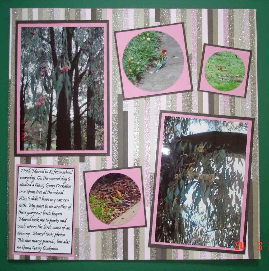
In the page above I have used another sheet from the glitter stack. It is much softer in colors and easier to work with. The page is along the same theme, my visit to Melbourne last year, with photos of the beautiful gum blossoms flowering along the river at this time of year, as well as the brightly colored rosellas we saw. The rosella pictured here is the Eastern Rosella.
Top Tips for the Day
- When buying a Glitter Stack always share it with friends. There is plenty to share, it makes it more economical and has many different designs to suit different tastes.
- Pages in Glitter Stacks are sometimes embossed and enhanced with glitter. You will need to us double sided tape to adhere your matted photos to these pages. I have found stickers aren’t strong enough to hold them to the page.
- Angle your photos for different effect, but maintain a balance within the page.
- Crop you photos to make your scrapbook design layouts more attractive.
I would be happy to have a comment or feedback please, if you find this page useful.
Happy scrappin!
Related Posts:
- Lyn’s Scrapbooking
- Scrapbook Designs and Scrapbook Sketches
- Lyn’s Scrapbook Designs and Tips for Beginners


Thanks for sharing your thoughts about Scrapbook Design Free tips and design ideas.
Scrapbook Design. Regards
Leuk wat je hier gedaan hebt!
I’m pleased you like my post on scrapbook design. Thanks for dropping by.